
It started over a Guinness
I was out for a pint with a good friend who works with a leading Irish meat producer, Kepak. Colin was telling me about a branding exercise he was driving at work to develop an identity for the site he works on, Site 317. Site 317 is renowned for its high standards and top-quality beef from Clonee, a region famous for its cattle production. Their beef is outstanding, and they wanted a visual identity that stands out too.
The team at Keepak had already decided on the name: 317. It's simplicity is only the beginning of the elegance of this choice, which I'll talk more about later. Discussions around it's character, heritage, and it's pride in the craft were also well underway by the time I joined the conversation. The 2 of us love this kind of shit, the chats were great, and so next thing I know I've dedicated a month of my evenings and weekends to exploring visual identity directions for 317.
Foundations
This was a passion project and a portfolio piece executed in my free time, so unfortunately some corners had to be cut off the process in order to turn something around quickly. Thankfully, Colin had already laid some really solid foundations and we worked closely together throughout. Colin and his team were open to (and encouraged) ideas explorations, as long as three key values are reflected:
A IS FOR ASSERTIVE
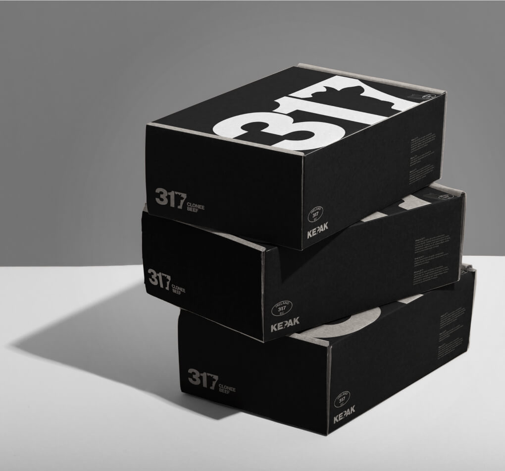
It’s second nature to anyone working in the industry to refer to the beef by site code rather than region or producer. Because of it's quality, vendors are already seeking out "317” by name. Using the site code as the brand name is highly functional, as well as being a statement of pride in the product and its reputation.
An early opportunity presented itself when I looked to the Kepak, the parent brand’s logo. The silhouette of the cow’s head cut out of the letter P had too much value baked into it to look past. Using the same technique, while communicating the package contents, would also create a visual link to Kepak’s trusted quality and their Irish roots.
I used Public sans, a clean open source typeface with a wide and thick font that could comfortably accommodate the cutout of the silhouette.


Another detail I couldn’t look past that came up in our ideation sessions was the EC (European Community) stamp that surfaced again and again in the pictures of the site that Colin shared. It’s used all over the place and so is instantly recognisable within the industry. Using the 317 stamp highlights pride in the specific site known for its beef quality.


B IS FOR BEHAN'S BULLS
An Táin & Louis le Brocquy
"An Táin," is an epic story in Irish mythology about a great cattle raid led by Queen Medb. The story features the legendary Brown Bull of Cooley and is rich with heroic battles and mythical figures.
I came across a particularly beautiful edition of this epic in my local library some years ago. Illustrated by a celebrated Irish artist, Louis le Brocquy, the brush strokes and style have stuck with me since.

Behan's Bulls
Colin pointed me towards the Irish sculptor John Behan, renowned for his sculptures of bulls. His works feature uniquely distorted forms that reminded me somewhat of the free brush stroke of Le Brocquy. Behan’s sculptures are rooted in Irish culture, reflecting the country's rich agricultural heritage, making them an appropriate concept to link to the 317 brand.


Drawing Inspiration from le Brocquy and Behan
We used the distinctive shapes from images of Behan’s bulls to create forms that capture the fluidity of le Brocquy's brush strokes. This approach creates a unique and flexible visual language, built from forms borrowed from great Irish artists—honouring their craft while creating something fresh.
It's worth noting that if we had taken this approach, the first step would have been to clear copyright permissions, but we didn't get that far in the end.


C IS FOR CRAIC
What's the craic?
For any non-Irish readers, this next section might be lost on you. First, “the craic” is slang for many things, but the point here is that at it’s heart is a bit of good spirited fun and banter.
The Angus cattle from Clonee are all black, and we leaned into that fact. Each image presents a 317 cow in a dramatic studio-style photoshoot—clean, dark, and refined, much like the brand’s commitment to craft and quality. But at a second look, the humour lands. A cow in a hurling helmet, another stepping out for a pint, or off for a dance—these details nod to Irish culture, pride and humour. This concept plays with the balance of taking the work seriously—but never taking yourself too seriously.
This design also hijacks the EC stamp—a mark already stamped across the industry. Just like the site code, it’s an internal system cleverly repurposed for brand recognition, reinforcing 317’s reputation.


A, B or C?
I myself swayed between the visual motif of direction B and the craic of direction C as my favourite concepts. That said, when the team (who also swayed back and forth a bit) decided to go with the lower risk Option A, I was happy with their decision too.
The main result from this project was the fun I had working on it. I really enjoyed collaborating with Colin, who’s open mind and bank of knowledge around Irish arts and culture was refreshing to work with.

